How Customer Behavior Analytics Improves Website Design Decisions
How Customer Behavior Analytics Improves Website Design Decisions
A good website should not be developed based on assumptions. Instead, it should reflect real visitor behaviors, areas of interest, clicking habits, and reasons for abandoning the website.
With customer behavior analytics, website development teams will get information that can help them understand which pages are effective, which calls-to-action or buttons are being ignored, how long forms are, and which sections of the website are confusing.
The point here is that design is not all about making things visually appealing. The website should be created in such a way as to make it easier for visitors to find their answers and act in a particular way.
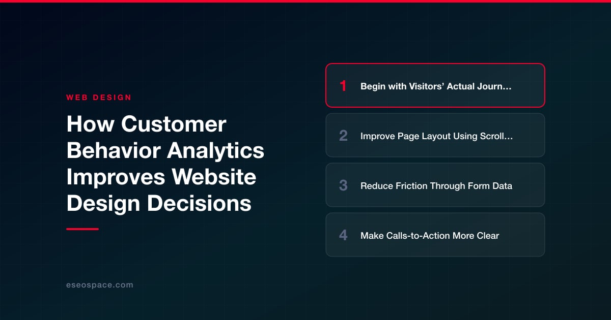
Begin with Visitors’ Actual Journeys
Most design teams create websites according to the company's needs. They ask themselves the following question: "What do we need to demonstrate?" The correct question here would be: "What is the user doing?"
Customer behavior analytics can help to get the answer to this question. Analytics can reveal the landing page used by visitors, the other pages they navigate to, and which ones they abandon. The problem may be hidden there if many users land on the pricing page and then exit the website.
The analysis of such behavioral data would be very useful for students majoring in UX design, marketing, and digital business since it allows them to analyze the correlation between design solutions and user behavior. If a student requires additional time to analyze the user journey or complete their assignments, Studyfy can help them handle the academic stress while focusing on analyzing website performance. Design thinking begins with observing behaviors.
According to Daniel Walker, an expert in digital learning and UX, "Good website design comes from watching what users do, not just asking what teams prefer." This is the basic concept. Analytics eliminates the subjective opinion from the design discussion.
Improve Page Layout Using Scroll and Click Data
If the page looks nice to the design team, analytics might prove something different. The scroll data will help see if users are reaching necessary sections; click data – if users are clicking on links, buttons or images.
If the user doesn’t scroll enough to see an offer, then it’s too far down on the page. If the click-through rate for a button is low, then the copy might not be good, the placement might be wrong, or the user might just not be ready.
Questions you can ask yourself when it comes to designing your web page are:
- Are they getting to the right section?
- Are they clicking the right call-to-action?
- Are they clicking things that aren’t actually clickable?
- Are they leaving before they even read the offer?
- Are mobile users doing anything different than desktop users?
This will help you make better design improvements than “just make it more modern”.
Reduce Friction Through Form Data
One of the easiest ways to lose a customer is through forms. The user wants to subscribe, schedule an appointment, buy something, get a quote, etc., but the form stops them.
Behavior analysis will help to identify where customers leave. They may leave after filling in the phone number field. They may leave because of being asked to make an account. Mobile customers may have difficulties filling the dropdown menu.
The solutions should be pretty straightforward – get rid of unnecessary fields, break up forms into several steps, add more explanations of error messages and the need for personal data. For instance, if a customer is asked to provide 12 pieces of information on a quote request form, reduce the number of required fields to 5. The website will be able to know more later.
Make Calls-to-Action More Clear
A call-to-action (CTA) is a prompt telling customers what to do next. Examples of CTAs may include "Book a Demo," "Start Free Trial," "Get a Quote," or "Download Guide."
Analytics would reveal whether CTA works. People could have been reading a certain page, but did not click because there was no match between their level of interest and the CTA. For example, a new visitor is not yet ready to “Buy Now,” but they could click on “See Pricing” or “Compare Plans.”
Here, behavior analytics helps improve design decisions. Rather than debating button colors, teams should experiment with better CTA wording, positioning, and page flow.
A good improvement of CTA involves the following recommendations:
- Use action verbs in your wording.
- Position the CTA near compelling evidence or benefits.
- Repeat CTA after significant parts.
- Align CTA with the purpose of a specific page.
- Optimize your button for tapping on mobile devices.
Minor CTA improvements work effectively because they direct the visitor precisely when they decide to act next.
Final Thoughts
Using customer behavior analytics for designing a website is beneficial because it reflects what customers really do. This approach will help the team to address navigation, layout, forms, calls-to-action, copy, and mobile issues without relying on assumptions.
Good design is always based on the same principle: observe the data, identify the issue, implement one change, and test its effect.
Aesthetics are great; usability is greater. Designing according to customer behavior makes customers less confused and more likely to believe in what you offer.
Put this into action with eSEOspace
We help businesses grow with website development that actually performs. Explore the services behind this guide:
Get a FREE Audit
We'll perform a comprehensive SEO, AEO, GEO & CRO audit of your website — completely free — and show you exactly how to outrank your competitors.
Don't have a site yet? Get in touch →
Get a FREE GEO/AEO/SEO Audit
We'll analyze your site's SEO, GEO, AEO & CRO — completely free — and show you exactly how to get found across Google and AI answers.
Don't have a site yet? Get in touch →
Great — your audit is on the way!
We'll send your free SEO/GEO/AEO/CRO audit within the next few hours. Where should we send it?
You're all set! ✓
Your free audit is being prepared — check your inbox in the next few hours. Talk soon!