

Blog
Top UX/UI Principles for High-Converting Shopify Stores
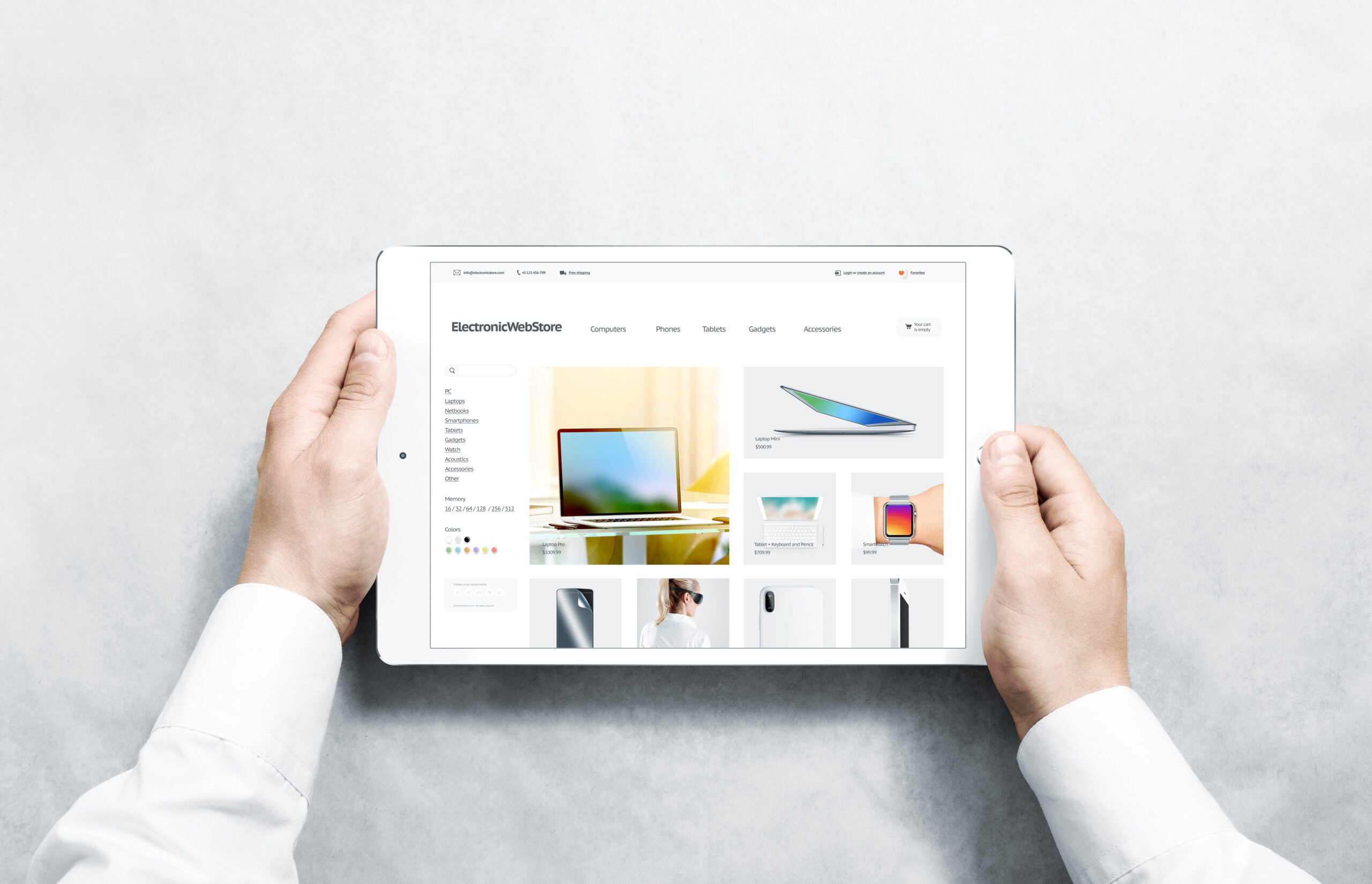
Your Shopify store's design isn't just about looking good—it's about guiding customers seamlessly from browsing to buying. While stunning visuals catch attention, it's the underlying UX/UI principles that turn visitors into loyal customers.
Research shows that 88% of online shoppers won't return to a website after a bad user experience. Even worse, 38% of users will stop engaging with a site if the layout is unattractive. This means every design decision on your Shopify store directly impacts your bottom line.
This guide explores the essential UX/UI principles that separate high-converting Shopify stores from the competition. You'll discover actionable strategies to optimize your store's user experience and boost conversion rates.
Why UX/UI Design Matters for Shopify Success
User experience (UX) focuses on how visitors interact with your store, while user interface (UI) deals with the visual elements they see and touch. Together, they create the foundation for successful ecommerce conversions.
Consider these compelling statistics:
- Stores with optimized UX see conversion rates 2-5 times higher than poorly designed competitors
- 70% of customers abandon their carts due to poor user experience
- A one-second delay in page loading can reduce conversions by 7%
- Mobile-optimized stores convert 67% better than those without responsive design
The best Shopify stores understand that great design isn't about personal preference—it's about removing friction from the buying process and making it effortless for customers to find, evaluate, and purchase products.
Principle #1: Prioritize Mobile-First Design
With mobile commerce accounting for over 60% of all online purchases, mobile-first design isn't optional—it's essential for survival.
Key Mobile UX Best Practices
Thumb-Friendly Navigation Design your interface for one-handed use. Place important buttons and links within the natural thumb reach zone (roughly the bottom two-thirds of the screen). This includes your "Add to Cart" buttons, navigation menu, and search functionality.
Simplified Checkout Process Mobile users abandon carts at much higher rates than desktop users. Streamline your checkout by:
- Offering guest checkout options
- Using auto-fill for shipping and billing information
- Implementing mobile payment options like Apple Pay and Google Pay
- Minimizing form fields to only essential information
Touch-Optimized Interface Elements Make sure all clickable elements are at least 44 pixels in size—the minimum recommended touch target size. Space buttons adequately to prevent accidental taps, and use visual feedback when users interact with elements.
Real-World Mobile Success
Reformation, the sustainable fashion brand, redesigned their mobile experience with larger product images, streamlined navigation, and one-tap social login. The result? A 40% increase in mobile conversion rates and 25% higher average order value from mobile users.
Principle #2: Design for Speed and Performance
Page speed directly impacts both user experience and conversion rates. Amazon found that every 100-millisecond delay in load time decreased sales by 1%.
Speed Optimization Strategies
Image Optimization Large, unoptimized images are the biggest culprit for slow Shopify stores. Implement these practices:
- Use WebP format for faster loading without quality loss
- Implement lazy loading for images below the fold
- Optimize image dimensions for different screen sizes
- Compress images to balance quality and file size
Clean Code Architecture Remove unnecessary apps, plugins, and custom code that slow your store. Every additional script increases load time. Audit your apps regularly and remove those that don't directly impact conversions or essential functionality.
Strategic Content Loading Prioritize above-the-fold content loading first. Use skeleton screens while content loads to maintain user engagement. Consider implementing progressive web app (PWA) features for even faster repeat visits.
Performance Benchmarks
Aim for these performance targets:
- Page load time under 3 seconds on mobile
- First contentful paint under 1.5 seconds
- Cumulative layout shift under 0.1
- Time to interactive under 5 seconds
Tools like Google PageSpeed Insights and GTmetrix help monitor and optimize these metrics.
Principle #3: Create Intuitive Navigation Architecture
Your navigation system guides customers through their journey. Poor navigation leads to confusion, frustration, and lost sales.
Navigation Best Practices
Clear Category Structure Organize products logically from your customers' perspective, not your internal systems. For example, a clothing store might organize by:
- Gender (Men, Women, Kids)
- Product type (Shirts, Pants, Accessories)
- Occasion (Work, Casual, Special Events)
- Brand or collection
Breadcrumb Navigation Breadcrumbs help users understand their location within your site hierarchy and provide easy paths back to broader categories. This is especially important for stores with deep product catalogs.
Smart Search Functionality Implement predictive search with auto-suggestions and error tolerance. Show product images in search results when possible. Consider adding filters for price, color, size, and other relevant attributes directly in search results.
Strategic Menu Design For desktop, use mega menus to showcase featured products and categories visually. On mobile, implement collapsible menu sections to prevent overwhelming users with too many options at once.
Navigation Success Example
Outdoor gear retailer Patagonia uses intuitive navigation that mirrors how customers think about activities. Instead of generic categories like "clothing," they organize by activities like "surfing," "climbing," and "running," making it effortless for customers to find relevant products.
Principle #4: Optimize Product Discovery and Display
How you present products significantly impacts purchase decisions. Great product presentation builds trust, provides necessary information, and motivates action.
Product Page Excellence
High-Quality Visual Content Invest in professional product photography that shows:
- Multiple angles and close-up details
- Products in use or lifestyle contexts
- Scale and size references
- Color variations and options
Implement zoom functionality and consider 360-degree product views for complex items.
Comprehensive Product Information Provide all information customers need to make confident purchase decisions:
- Detailed specifications and dimensions
- Materials and care instructions
- Size guides and fit information
- Customer reviews and ratings
- Related or complementary products
Social Proof Integration Display customer reviews, ratings, and user-generated content prominently. Include photos from real customers when possible. Show recent purchase notifications or "customers also viewed" sections to create urgency and social validation.
Collection Page Optimization
Effective Filtering and Sorting Allow customers to filter products by relevant attributes like price, color, size, brand, and customer ratings. Provide multiple sorting options including popularity, price, newest arrivals, and customer ratings.
Grid Layout Best Practices Use consistent product card designs that show key information at a glance. Include product name, price, key features, and customer rating. Ensure images are consistent in aspect ratio and quality.
Principle #5: Streamline the Checkout Experience
The checkout process is where you either complete the sale or lose the customer. Focus on removing friction and building confidence.
Checkout Optimization Strategies
Progress Indicators Show customers where they are in the checkout process and how many steps remain. This reduces anxiety and cart abandonment.
Multiple Payment Options Offer various payment methods including:
- Credit and debit cards
- Digital wallets (PayPal, Apple Pay, Google Pay)
- Buy now, pay later options (Klarna, Afterpay)
- Local payment methods for international customers
Trust Signals Display security badges, SSL certificates, and money-back guarantees prominently during checkout. Include customer service contact information for immediate assistance.
Error Prevention and Handling Use real-time validation for form fields to prevent errors before submission. When errors occur, provide clear, helpful messages that guide users to solutions.
Checkout Success Story
Fashion retailer ASOS reduced cart abandonment by 50% after implementing express checkout options, guest checkout, and displaying total costs (including shipping) upfront. They also added exit-intent popups offering help or discounts to hesitant customers.
Principle #6: Implement Effective Visual Hierarchy
Visual hierarchy guides users' attention to the most important elements on each page. Poor hierarchy creates confusion and decision paralysis.
Visual Hierarchy Techniques
Size and Scale Make important elements larger than less important ones. Your "Add to Cart" button should be the most prominent element on product pages. Headlines should be larger than body text, and primary calls-to-action should stand out from secondary options.
Color and Contrast Use color strategically to guide attention. Your brand's primary color should highlight important actions like "Buy Now" or "Add to Cart." Ensure sufficient contrast for accessibility—aim for at least 4.5:1 contrast ratio between text and background.
White Space Usage Don't be afraid of white space. It improves readability, reduces cognitive load, and makes important elements stand out. Crowded layouts overwhelm users and reduce conversion rates.
Typography Hierarchy Use consistent heading structures (H1, H2, H3) and maintain typographic hierarchy throughout your store. Limit yourself to 2-3 font families maximum to maintain visual consistency.
Principle #7: Build Trust Through Design
Trust is crucial for online purchases, especially for new customers. Your design choices either build or erode confidence.
Trust-Building Design Elements
Professional Visual Quality Invest in high-quality photography, consistent branding, and polished design elements. Poor visual quality immediately signals unprofessionalism and reduces trust.
Transparent Information Clearly display:
- Shipping costs and delivery times
- Return and exchange policies
- Contact information and customer service hours
- Physical business address if applicable
- Security and privacy policies
Social Proof Integration Showcase customer testimonials, reviews, press mentions, and trust badges prominently throughout your store. Display real customer photos using your products when possible.
Error-Free Experience Broken links, outdated information, and technical errors destroy trust instantly. Regularly audit your store for issues and fix them promptly.
Principle #8: Optimize for Accessibility
Accessible design isn't just the right thing to do—it expands your potential customer base and often improves usability for all users.
Key Accessibility Practices
Color Accessibility Don't rely solely on color to convey information. Use text labels, icons, or patterns alongside color coding. Ensure sufficient contrast ratios for all text elements.
Keyboard Navigation Make sure users can navigate your entire store using only a keyboard. This benefits users with motor disabilities and those using assistive technologies.
Alternative Text for Images Provide descriptive alt text for all images, especially product photos. This helps screen readers and also improves SEO.
Clear Focus Indicators Make it obvious which element currently has keyboard focus. This helps users with visual impairments or those navigating with keyboards.
Principle #9: Leverage Personalization and Smart Recommendations
Personalized experiences increase engagement and average order values significantly.
Personalization Strategies
Behavioral Recommendations Show products based on browsing history, past purchases, and similar customer behavior. Implement "Recently Viewed," "You May Also Like," and "Customers Who Bought This Also Bought" sections.
Geographic Personalization Display local currency, shipping options, and relevant products based on customer location. Show local inventory availability when applicable.
Shopping History Integration For returning customers, display purchase history, reorder options, and personalized recommendations based on past buying patterns.
Smart Product Recommendations
Position recommendation sections strategically:
- Related products on product pages
- Cross-sell items in cart
- Upsell suggestions during checkout
- Personalized homepage sections for returning visitors
Principle #10: Test and Iterate Based on Data
The best UX/UI decisions are based on real user behavior, not assumptions.
Testing Strategies
A/B Testing Test different versions of key pages like product pages, checkout flows, and landing pages. Focus on one element at a time for clear results. Common elements to test include:
- Button colors and text
- Product page layouts
- Checkout flow steps
- Navigation structures
User Behavior Analysis Use tools like heatmaps, session recordings, and user surveys to understand how customers actually interact with your store. Look for patterns in where users click, scroll, and exit your site.
Conversion Funnel Analysis Identify where customers drop off in their journey and optimize those specific points. Pay special attention to cart abandonment points and checkout friction.
Performance Monitoring
Track key UX metrics including:
- Page load times across different devices
- Mobile vs. desktop conversion rates
- Cart abandonment rates by traffic source
- Search functionality usage and success rates
- Customer support ticket patterns
Make Your Website Competitive.
Leverage our expertise in Website Design + SEO Marketing, and spend your time doing what you love to do!
Implementing UX/UI Principles: Your Action Plan
Immediate Actions (Week 1)
- Mobile Audit: Test your store on various mobile devices and note friction points
- Speed Test: Use Google PageSpeed Insights to identify performance issues
- Navigation Review: Have someone unfamiliar with your store try to find specific products
- Checkout Test: Complete a purchase on your own store and identify pain points
Short-Term Improvements (Month 1)
- Optimize Images: Compress and resize all product images
- Simplify Navigation: Reduce menu complexity and improve category organization
- Add Trust Signals: Display security badges, reviews, and contact information prominently
- Mobile Optimization: Ensure all functionality works smoothly on mobile devices
Long-Term Enhancements (Months 2-6)
- Implement A/B Testing: Start testing different page elements systematically
- Add Personalization: Implement product recommendations and behavioral targeting
- Accessibility Improvements: Audit and improve accessibility features
- Advanced Analytics: Set up detailed conversion tracking and user behavior analysis
Measuring UX/UI Success
Track these key performance indicators to measure the impact of your UX/UI improvements:
Conversion Metrics
- Overall conversion rate
- Mobile conversion rate
- Average order value
- Cart abandonment rate
- Checkout completion rate
Engagement Metrics
- Time on site
- Pages per session
- Bounce rate
- Search usage and success
- Return visitor rate
Technical Metrics
- Page load speed
- Mobile usability score
- Core Web Vitals
- Error rates
- Uptime percentage
Common UX/UI Mistakes to Avoid
Design Mistakes
- Prioritizing aesthetics over functionality
- Using too many fonts or colors
- Hiding important information
- Making buttons too small for mobile
- Poor color contrast
Navigation Mistakes
- Complex or confusing menu structures
- Missing search functionality
- No breadcrumb navigation
- Broken or outdated links
- Too many clicks to reach products
Checkout Mistakes
- Requiring account creation
- Hidden fees revealed late
- Too many form fields
- Poor error messaging
- Missing security indicators
The Future of Shopify UX/UI
Stay ahead of trends that will shape ecommerce design:
Emerging Trends
- Voice commerce integration
- Augmented reality product visualization
- AI-powered personalization
- Progressive web apps
- Micro-interactions and animations
Technology Adoption
- Headless commerce architectures
- Advanced chatbot integration
- Biometric authentication
- Sustainable design practices
- Inclusive design standards
Ready to Transform Your Shopify Store's UX/UI?
Implementing these UX/UI principles requires strategy, expertise, and ongoing optimization. While you can tackle some improvements yourself, complex changes often benefit from professional design and development expertise.
Great UX/UI design isn't just about making things look pretty—it's about creating experiences that guide customers naturally toward purchase decisions while building trust and satisfaction.
Our team specializes in applying these exact principles to create high-converting Shopify stores. We've helped businesses increase conversion rates by up to 200% through strategic UX/UI optimization focused on real user behavior and business goals.
Ready to see what optimized UX/UI can do for your Shopify store? Contact us today for a free UX audit. We'll analyze your current store against these principles and provide actionable recommendations to boost your conversion rates.
Let's create an exceptional shopping experience that turns more visitors into customers.
Make Your Website Competitive.
Leverage our expertise in Website Design + SEO Marketing, and spend your time doing what you love to do!