



Point of Care
Brochures: Point of Care
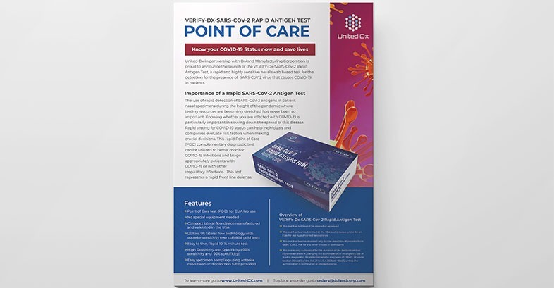
Point of Care
This brochure design for Point of Care was developed to clearly communicate critical healthcare information in a format that is professional, accessible, and easy to navigate. Our focus was on creating a clean, structured layout that supports fast comprehension while maintaining visual credibility for a medical and diagnostic audience. Strategic use of color, hierarchy, and spacing helps guide readers through complex content without overwhelming them. The final design balances clarity and authority, ensuring the brochure works effectively in clinical, informational, and point-of-distribution settings. Every design decision was made to reinforce trust, accuracy, and usability, resulting in a polished print piece that supports brand consistency and communicates essential details with confidence and precision.
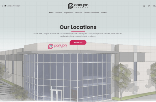
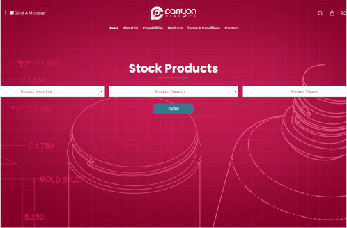
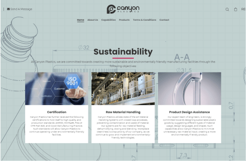
Canyon Plastics Website Design
This website design project for Canyon Plastics focused on creating a clean, structured digital experience that reflects the company’s scale, precision, and industrial expertise. The goal was to design a modern, easy-to-navigate interface that clearly presents product categories, locations, and sustainability efforts while maintaining a strong, professional visual identity. Thoughtful layout decisions, consistent branding, and clear content hierarchy help users quickly find key information without friction. The final design balances functionality with visual clarity, ensuring the site supports both usability and brand credibility across desktop and mobile experiences. From page structure to color usage and typography, every element was intentionally crafted to reinforce trust, showcase operational strength, and position Canyon Plastics as a reliable, forward-thinking manufacturing partner in a competitive industry.
