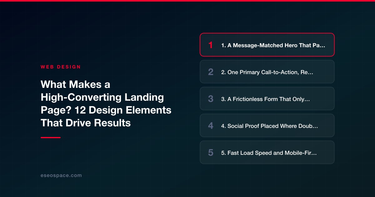
What Makes a High-Converting Landing Page? 12 Design Elements That Drive Results
What Makes a High-Converting Landing Page? 12 Design Elements That Drive Results
Key Takeaways
- A high-converting landing page focuses on a single goal with one primary call-to-action, removing navigation and distractions that pull visitors off the conversion path.
- The hero section must pass a five-second test by matching the ad's message and leading with the visitor's desired outcome rather than your brand name.
- Reducing form friction, adding credible social proof near the CTA, and offering a risk reversal directly lift conversion rates with minimal design effort.
- Fast load speed, mobile-first layout, and clear visual hierarchy are conversion features, not just technical nice-to-haves, especially for paid mobile traffic.
- Sustained gains come from continuous A/B testing and funnel analysis—treat every landing page as a hypothesis to refine, not a finished asset.
A landing page has exactly one job: convert a specific visitor into a specific action. Unlike a homepage that serves many audiences and many goals, a high-converting landing page removes every distraction and channels attention toward a single decision. That focus is why landing pages consistently outperform general pages for paid traffic, email campaigns, and lead generation.
The difference between a page that converts at 2% and one that converts at 8% is rarely luck or a single clever headline. It is the accumulation of a dozen design decisions working together: how fast the page loads, how quickly the value is clear, how much friction the form creates, and how much trust the layout earns. Below are the 12 design elements that separate landing pages that quietly leak budget from ones that reliably drive results.
These are the same principles we apply in our landing page design work, and none of them require a huge budget—just discipline and a willingness to test.
1. A Message-Matched Hero That Passes the 5-Second Test
The hero section—everything visible before scrolling—decides whether visitors stay or bounce. Within roughly five seconds, a visitor should be able to answer three questions: What is this? What will it do for me? What do I do next? If your ad promised "same-day plumbing repair" and your hero says "Welcome to our website," you have broken the scent trail and wasted the click.
- Match the message: Echo the exact language and offer from the ad or email that drove the click.
- Lead with the outcome, not your company name or logo. Visitors care about their problem, not your brand story.
- Pair a benefit-driven headline with a supporting subhead that explains how you deliver it.
A relevant, specific hero image or short product visual reinforces the message far better than a generic stock photo of people shaking hands.
2. One Primary Call-to-Action, Repeated Strategically
Every additional choice you give a visitor dilutes the one choice that matters. High-converting pages maintain a 1:1 attention ratio—one page, one goal, one primary call-to-action. That does not mean one button; it means one type of action, repeated as the visitor scrolls.
Make the CTA button impossible to miss with a contrasting color that stands apart from the rest of the palette. The button copy should describe the outcome, not the mechanic: "Get My Free Quote" converts better than "Submit." Place your first CTA in the hero, then repeat it after each major proof point so a convinced visitor never has to scroll hunting for the next step.
3. A Frictionless Form That Only Asks What You Need
Form length is one of the most direct levers on conversion rate. Each additional field gives the visitor another reason to abandon. Ask only for what your sales process genuinely requires at this stage—often just a name and email or phone number.
- Cut optional fields ruthlessly; you can gather more detail after the lead converts.
- Use multi-step forms for complex offers—starting with an easy question builds momentum before you ask for contact details.
- Label clearly and inline-validate so errors are caught before submission, not after a frustrating reload.
- Reassure at the point of friction: a short line like "No spam. Unsubscribe anytime" beside the button reduces hesitation.
4. Social Proof Placed Where Doubt Peaks
People look to others to validate decisions, especially when spending money or sharing contact information. Social proof is most effective when it appears right where doubt naturally rises—next to the CTA and pricing, not buried in a separate tab.
Specific, credible proof outperforms vague praise. "Rated 4.9 from 300+ verified reviews" or a testimonial that names a concrete result carries more weight than "Great service!" Effective forms of proof include client logos, star ratings, review counts, short outcome-focused testimonials, certifications, and trust badges. The key is authenticity: representative, verifiable proof builds trust, while exaggerated or generic claims quietly erode it.
5. Fast Load Speed and Mobile-First Layout
Speed is a conversion feature, not just a technical metric. Conversion rates drop sharply as load time climbs past a few seconds, and the majority of paid traffic now arrives on phones. A page that looks brilliant on a desktop but forces mobile users to pinch, zoom, or wait will bleed conversions regardless of how good the copy is.
- Compress and lazy-load images, and serve modern formats like WebP.
- Design for the thumb: large tap targets, single-column flow, and a CTA reachable without scrolling forever.
- Test on real devices and slower connections, not just a fast office network.
Thoughtful website design bakes performance in from the start rather than bolting it on afterward, which is far cheaper than retrofitting a slow page later.
6. Visual Hierarchy That Guides the Eye
A high-converting page tells the visitor where to look and in what order. Visual hierarchy—achieved through size, color, contrast, spacing, and directional cues—guides attention down a deliberate path toward the CTA.
Use generous whitespace to isolate important elements; crowded pages feel overwhelming and hide the action you want. Size headlines larger than body text, reserve your brightest accent color for the button alone, and use subtle directional cues—an image where a person looks toward the form, or an arrow—to point toward the conversion point. When everything competes for attention, nothing wins it.
7. Benefit-Focused Copy That Overcomes Objections
Features describe your product; benefits describe the visitor's better life. High-converting copy translates every feature into a concrete outcome and then systematically dismantles the reasons someone might hesitate.
- Lead with benefits: "Book more appointments" beats "AI-powered scheduling engine."
- Use bullet points for scannability—most visitors skim before they read.
- Address objections directly: price, risk, time, and "will this work for me?" Answer them near the CTA so nothing blocks the click.
- Write like a human, in the visitor's own words, not internal jargon.
8. A Risk Reversal That Removes the Fear of Saying Yes
Even a convinced visitor hesitates at the moment of commitment. A risk reversal shifts the perceived risk from the buyer to you and often produces an outsized lift for very little design effort.
Common examples include a money-back guarantee, a free trial with no card required, a free consultation, or a clear no-obligation promise. Place this reassurance close to the button, where the fear actually lives. The message is simple: taking the next step costs the visitor nothing, so there is no reason to wait.
9. Message Consistency From Ad to Action
Conversion is a chain, and it breaks at the weakest link. If your ad, headline, form, and thank-you page tell one continuous story, visitors feel confident they are in the right place. If any step contradicts another—different offer, different tone, unexpected price—trust collapses.
Maintain consistent language, colors, and offers across the entire funnel. This is where structured conversion rate optimization pays off: methodically aligning traffic source, page, and follow-up so each stage reinforces the last instead of introducing doubt.
10. Trust Signals and Transparent Details
Beyond testimonials, visitors scan for cues that you are a legitimate, safe business. Missing trust signals create subconscious hesitation even when the offer is strong. Reassure them with visible proof of legitimacy.
- Security cues: HTTPS, recognizable payment badges, and privacy assurances near forms.
- Real contact information: a phone number, address, or live chat signals a real company behind the page.
- Transparent pricing and terms where relevant—hidden costs are a leading cause of abandonment.
11. Directional and Distraction-Free Design
A dedicated landing page should not carry the full site navigation. Every link in a header or footer is an exit ramp away from your goal. Removing top navigation on campaign pages is one of the most reliable ways to lift conversion because it keeps the visitor on the single path you designed.
Strip out anything that competes with the CTA: no social feeds, no unrelated offers, no menu of a dozen links. The only meaningful choices on the page should be to convert or to leave—and good design makes converting the easier option.
12. Continuous Testing and Iteration
No one designs the perfect landing page on the first attempt. The highest-converting pages are the product of ongoing measurement and refinement. Treat every page as a hypothesis to be tested, not a finished asset.
- A/B test one element at a time—headline, CTA copy, hero image, form length—so you know what actually moved the number.
- Track the full funnel: not just conversions, but scroll depth, form starts, and where visitors drop off.
- Prioritize high-impact tests like the offer and hero before fussing over button shades.
- Review heatmaps and recordings to see what real visitors do, not what you assume they do.
When these twelve elements work together—clear message, single focused action, minimal friction, and constant refinement—a landing page stops being a passive brochure and becomes a dependable engine for leads and sales.
Get a FREE Audit
We'll perform a comprehensive SEO, AEO, GEO & CRO audit of your website — completely free — and show you exactly how to outrank your competitors.
Don't have a site yet? Get in touch →
Put this into action with eSEOspace
We help businesses grow with website development that actually performs. Explore the services behind this guide:
Frequently Asked Questions
What is a good conversion rate for a landing page?
How long should a high-converting landing page be?
Should a landing page have navigation links?
What is the most important element on a landing page?
How do I improve a landing page that isn't converting?
Get a FREE GEO/AEO/SEO Audit
We'll analyze your site's SEO, GEO, AEO & CRO — completely free — and show you exactly how to get found across Google and AI answers.
Don't have a site yet? Get in touch →
Great — your audit is on the way!
We'll send your free SEO/GEO/AEO/CRO audit within the next few hours. Where should we send it?
You're all set! ✓
Your free audit is being prepared — check your inbox in the next few hours. Talk soon!


On this page
- Key Takeaways
- 1. A Message-Matched Hero That Passes the 5-Second Test
- 2. One Primary Call-to-Action, Repeated Strategically
- 3. A Frictionless Form That Only Asks What You Need
- 4. Social Proof Placed Where Doubt Peaks
- 5. Fast Load Speed and Mobile-First Layout
- 6. Visual Hierarchy That Guides the Eye
- 7. Benefit-Focused Copy That Overcomes Objections
- 8. A Risk Reversal That Removes the Fear of Saying Yes
- 9. Message Consistency From Ad to Action
- 10. Trust Signals and Transparent Details
- 11. Directional and Distraction-Free Design
- 12. Continuous Testing and Iteration